
From processing to money movement to stablecoins, blue dominates conference stands, company websites and brand palettes across the payments industry. But does blending into the crowd come with a cost? We spoke to Nicole Zimmermann, Founder and CEO of ZELOCIN & Partners, about the data, brand impact and potential points of action.

If you work for a company focusing on cross-border payments, or payments more broadly, there’s a strong likelihood that your brand colour palette includes a shade of blue. The data backs this up: in an analysis of the brand palettes of 144 companies in the sector, we found that 63% had a shade of blue in their core brand palette.
This analysis was prompted by the insights of Nicole Zimmermann, Founder and CEO of strategic marketing consulting firm ZELOCIN & Partners and former CMO of Western Union’s B2B division. Having become increasingly aware of the preponderance of blue on the show floors of industry conferences Money20/20 Europe and USA in 2024, she has since shared a number of insights on brand positioning and differentiation related to the issue.
“From startups to scale-ups to IPOs, everyone at one point needs to tell the story of why their product and their service is different, but then you look at how they present themselves and it’s the sea of blue,” she says.
“They don’t separate themselves in terms of colour identity, and how they talk about products and services it’s the same thing: they all use the same keywords. So this becomes a very expensive marketing investment.”
The data behind the payments industry’s use of blue
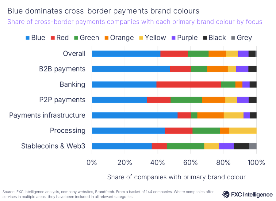
The overindexing of blue is also seen in the lead colour used by companies in the sector, with 42% of the companies we analysed having a shade of blue as their primary colour.
This is significantly more than the next most common colour, red, which is only the dominant colour for 17% of brands in the space, and is largely found within the banking sector.
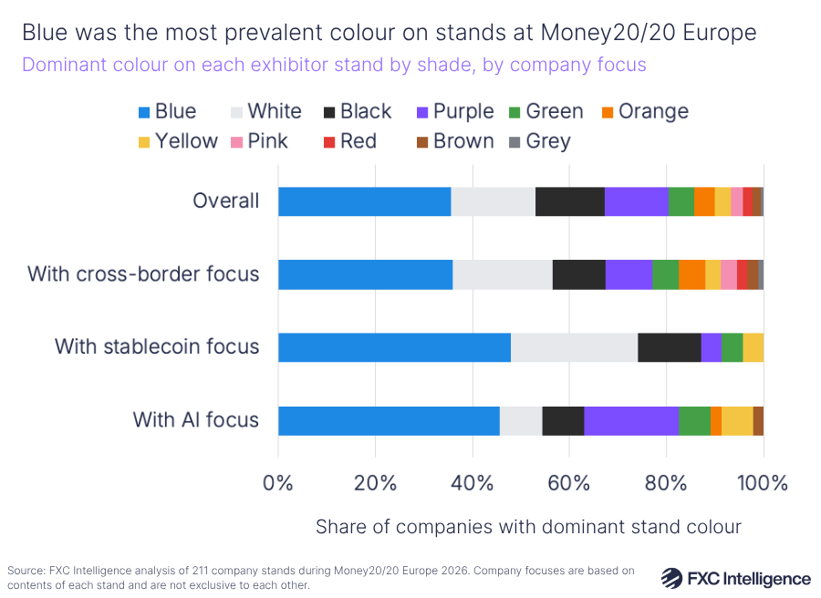
This is also reflected in how companies present themselves at industry events. Our analysis of 211 stands at the most recent Money20/20 Europe conference found that blue was the most dominant shade on 36% of stands both overall and for companies specifically focused on cross-border payments.
However, it was more prevalent still in companies focused on technology-led solutions, with 46% of companies showcasing AI solutions having blue as their most dominant colour, while the same was true for 48% of those promoting stablecoin offerings.
After this, white, black and purple were the next most common shades, creating a show floor that is largely visually consistent.
While visually or tonally consistent branding is something that many industries have grappled with, Zimmermann sees the prevalence of blue as something that is largely only found in payments, fintech and the broader technology sector.
“The sea of blue is very unique and very dominant in financial services and fintech,” she says, adding that this is not something she has observed in the same way in other industries that her firm caters to.
“From client experience, it’s not an issue in the same way in other industries.”
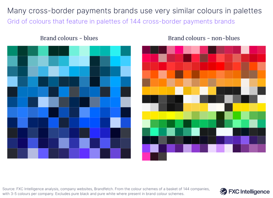
This use of blue also means that many brands are using shades that are near identical or at the very least very hard to distinguish from each other. Our analysis of the primary hex code colours of 144 industry brands found that 50% of the brands with blue as a lead colour had at least one other brand with a shade within 20 RGB units, while 13% had at least one brand with a shade within 10.
By contrast, the gap between a mid blue and a mid green is around 360 RGB units; a difference of 20 means it would be very challenging to differentiate two shades visually without placing them side-by-side, while a difference of 10 would make it hard to differentiate between them even placed next to each other.
Why blue – and its potential branding impact
It isn’t entirely clear how the over-use of blue in the sector began. It’s possible that the design of some early technology brands such as IBM has had an impact on the shades associated with professionalism in the space, and there is some evidence to suggest that companies who cater to enterprise-level organisations are more likely to over-index with blue.
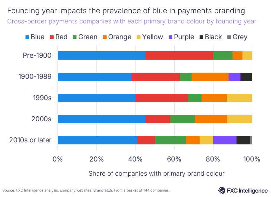
When a company was founded also plays some role, with 46% of companies founded in the 2000s and 45% before 1900 having blue as their lead colour, compared to 40% of those founded in the 1990s, 41% in the 2010s or later and 38% between 1900 and 1989.
However, the use of blue is also likely favoured due to the psychological associations it holds.
“Blue conveys trust, it conveys belief. People can see a lot of things in blue,” explains Zimmermann, adding that many brands appear to have seen this sense of trust in established brands and looked to replicate it for themselves.
“If some of the big brands have it, then you think, ‘they are positioning themselves as a trusted, reliable partner, so maybe if I go with blue, then this will be just a spillover effect for me’.”
What’s in a shade
While for many companies, choosing a colour scheme is a minor concern, when used correctly it has a powerful storytelling element according to Zimmermann.
“More people should ask the question: when you found the company, what are the emotions you go through in the vision for the company?” she asks, adding that this emotional connection can be very effectively conveyed through colour.
When founding her own company, she considered colours often associated with consulting brands, such as McKinsey’s blue or Bain’s red, but ultimately decided on the pairing of pink and yellow as a reflection of her own personal style, reflecting ZELOCIN’s status as a brand run by a sole entrepreneur.
For other brands, the choice of colours conveys significant meaning in other ways. Western Union, for example, is famous for its use of black and yellow, which Zimmermann says aligns with its heritage.
“It had to do with electricity and telegraph and how money traveled. That’s how the yellow came about, and black was there to make it work in different instances.”
However, by opting for shades that are commonplace in the industry rather than focusing on those that reflect their own offering and personality, Zimmermann argues that they are risking getting lost in a “sea of sameness”, not only from their use of colour but also through the same keywords, in particular, “reliable, secure and seamless”.
“If from the beginning you make the choice to really differentiate, if you invest your money, it will just accelerate your differentiation,” she says.
“Whereas if you bet on blue and you bet on the same words, you are actually depleting your money and your investment into your differentiation.”
The increasing use of artificial intelligence in marketing is only exacerbating this phenomenon, as it is further replicating the use of common shades and phrases across the industry.
“AI will write you a whole brand differentiation and it will write you the whole go-to-market strategy,” says Zimmermann. “But brand differentiation is an art and a science. AI hasn’t figured that out yet. It can give you some good directions, but it can’t solve that.”
Not all sectors are equal: Where the pattern holds and breaks
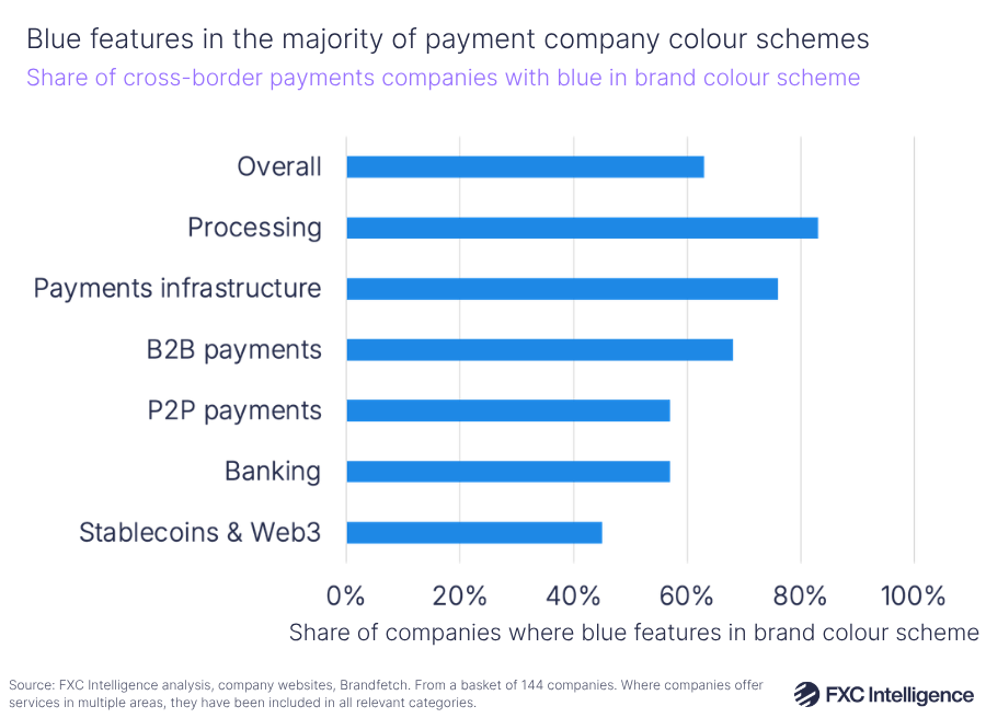
While blue is widespread across the payments industry, there are some segments where it is more common than others. When considering all shades used within each brand’s primary colour scheme, payments processing saw the highest share of companies using blue, at 83%, however this dropped to 44% when looking at primary brand colour alone.
Other leading sectors include B2B payments, where 68% of brands used blue in their main colour scheme but 48% had it as their primary shade, while 76% of payments infrastructure providers had blue in their colour scheme and 52% as their primary colour.
By contrast, consumer payments, otherwise known as C2C or P2P, saw just 57% of brands having blue in their colour scheme, with 33% using it as their lead shade.
This suggests that blue is more popular among companies who directly sell to other companies rather than consumers, which reflects a wider difference in marketing approach.
“Brands are much more likely to experiment in C2C and to cater to a potentially younger audience, where you need to be a little bit more trendy,” says Zimmermann.
“A B2B brand is much more focused on traditional brand positioning and brand management.”
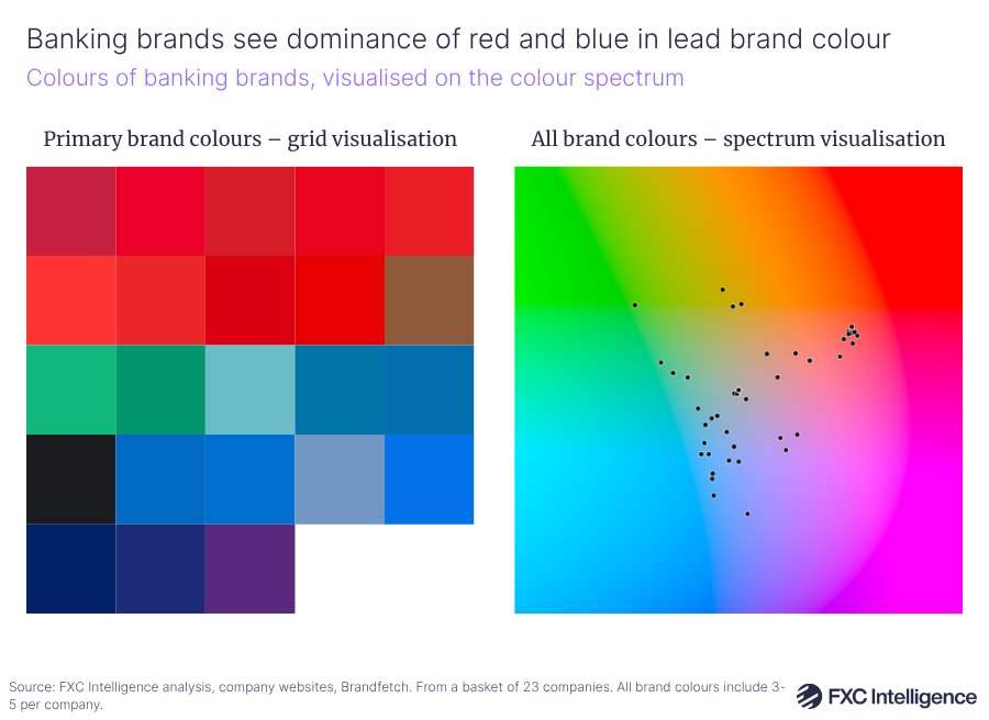
One segment with notable divergence, however, is banking – the only segment to see another shade dominate as much as blue. Here, red is as commonplace as the lead shade as blue, with both having 39% of banking brands with each as their lead colour, compared to 17% of all brands with red. Banking also sees a greater share of red across wider company colour palettes, with 48% having it in their colour set, compared to 26% overall.
This phenomenon is likely in part due to the associations of red with finance, through its use to convey confidence and prosperity as well as in traditional economic settings such as the UK budget. The greater prevalence of longstanding brands within this sector may also play a role due to the increased time these companies have had to evolve their brand.
“That is definitely something that I would expect has happened over years and years,” adds Zimmermann. “You need one element to stand out of the sea of blue.”
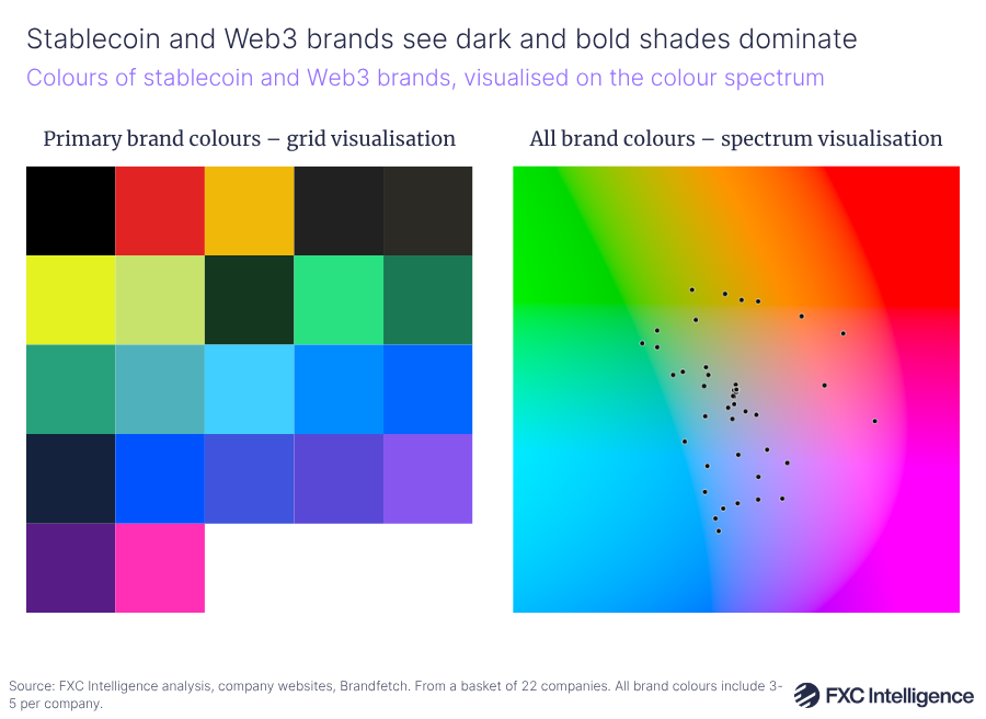
On the other end of the spectrum, companies largely focused on stablecoins and related Web3 technologies, which have almost exclusively been founded within the last two decades, are notable for evolving their use of colour. This sector is the only one to have less than half of brands (45%) using blue in their colour schemes at all, and the second lowest after P2P to use it as their primary colour, at 36%.
Breaking through with branding: The lighthouses
While there are many companies that Zimmermann sees as very similar in terms of their colour scheme and positioning, there are those that stand out as the “lighthouses” in the industry ocean.
“When you walk this sea of blue, you right away stop in your tracks when someone grabs your attention,” she explains.
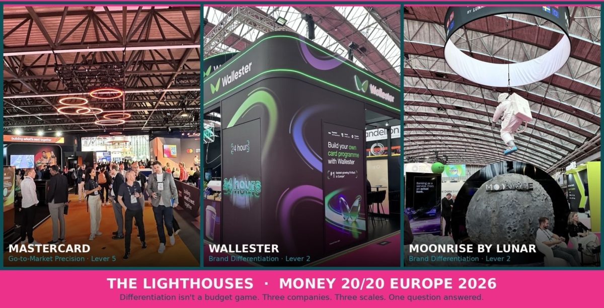
At Money20/20 Europe 2026, she identified three organisations in particular that stood out as these lighthouse companies, each of a different scale.
At the largest end of the spectrum is Mastercard, which she said stood out “beautifully”.
“No one could really avoid this brand because to cross through those two halls, you had to go through it. The brand is there, the colour orange,” she says.
Next is card issuing and payment platform Wallester, who stood out for its choice of colour.
“That green in the sea of blue is just eye-catching, and they did a great job with activation on the ground with their people in uniform approaching you. So it’s never one thing alone.”
Finally, Lunar’s use of a moon theme for its stand was particularly strong for storytelling.
“You think about where it takes you: the sky is not the limit.”
Strategies for differentiation
For companies looking to improve their differentiation, ZELOCIN developed a Growth Playbook consisting of five levers the company focuses on when working with brands. This starts with market clarity, which Zimmermann says “includes the competitive landscape”, followed by brand differentiation.
“You need to really understand where you’re competing and how you compete best,” she explains. “If you have that as the starting point, then it should not be too challenging with smart people around to say, ‘how can we brand differentiate?’”
Following in third is customer understanding, which focuses on building a data-driven picture of customer behaviour.
“How are customers shopping? How are they buying these products? Are they C2C customers? Are they B2B customers?”
This builds on differentiation, but also leads onto the fourth lever, value proposition sharpness, which focuses on language used by companies to convey their offering.
“What problems are you solving? What values are you adding?” she asks.
Finally, in fifth is go-to-market precision, which focuses on allocating resources strategically based around the “four Ps of marketing”: price, product, place and promotion.
Looking beyond blue
This is an approach that takes companies far beyond just colour scheme, however colour has an important role to play in this wider positioning strategy. And for those considering other shades while wanting to retain a sense of trust, there are other options to consider, with green being the “next in line”, while red and orange carry more complex messages.
There are companies that have successfully moved beyond blue themselves. In 2023 Wise ditched its own blue in favour of a green-based colour scheme, which the company at the time said “draws on global currencies, languages, alphabets and places from around the world, and captures the energy and dynamism of our customers”.
Meanwhile 2025 also saw us at FXC Intelligence move away from our own shade of blue in favour of a purple-led colour scheme, selected to reflect the innovation and insight that underpins our data-led product offerings for payments.
No matter how companies approach colour, however, the challenge is differentiation – and it’s something we are likely to see ever more focus on as the industry evolves.